Brand Identity for a New Medical Spa in the Vail Valley
Alpine Skin Rejuvenation is a medical spa in the Vail Valley that serves men and women who want to enhance their natural beauty through quality, science based treatment. The owner and founder, Heidi, wanted a brand identity that felt naturalistic and approachable, yet still conveyed her years of experience in the medical field and commitment to science based treatments. Heidi has lived in the Vail Valley for over 20 years and wanted to create a medical spa that catered to the specific goals and values of her local community; health, wellness and natural beauty.
CLIENT
Alpine Skin Rejuvenation
Medical Spa
SERVICES
Branding
Print & Collateral
The client was drawn to tones of blue and grey to symbolize the color of the mountains. She preferred simple, elegant typography paired with minimalistic design shapes.
Moodboard
Client Inspiration
This Aspen leaf photo was taken by the client and now hangs in the entry way to her office. This image naturally became the central idea for the new brand identity.
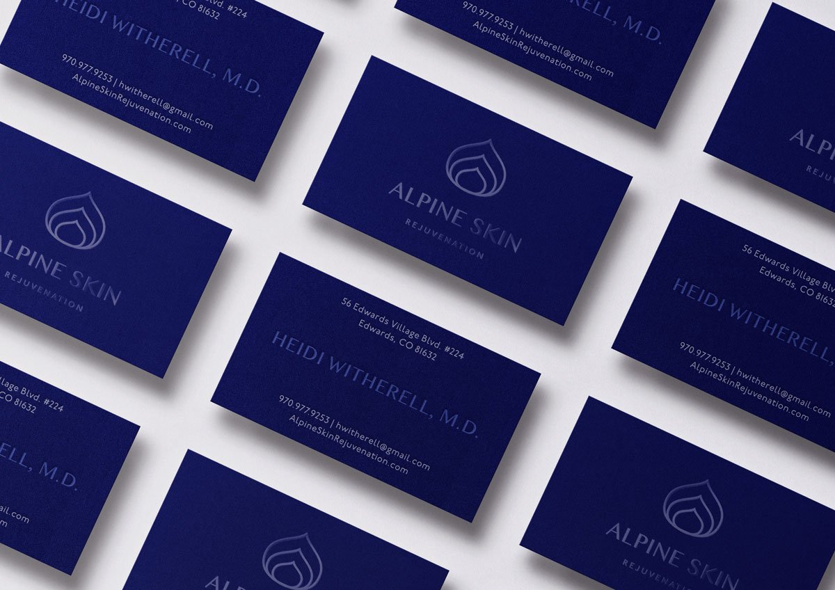
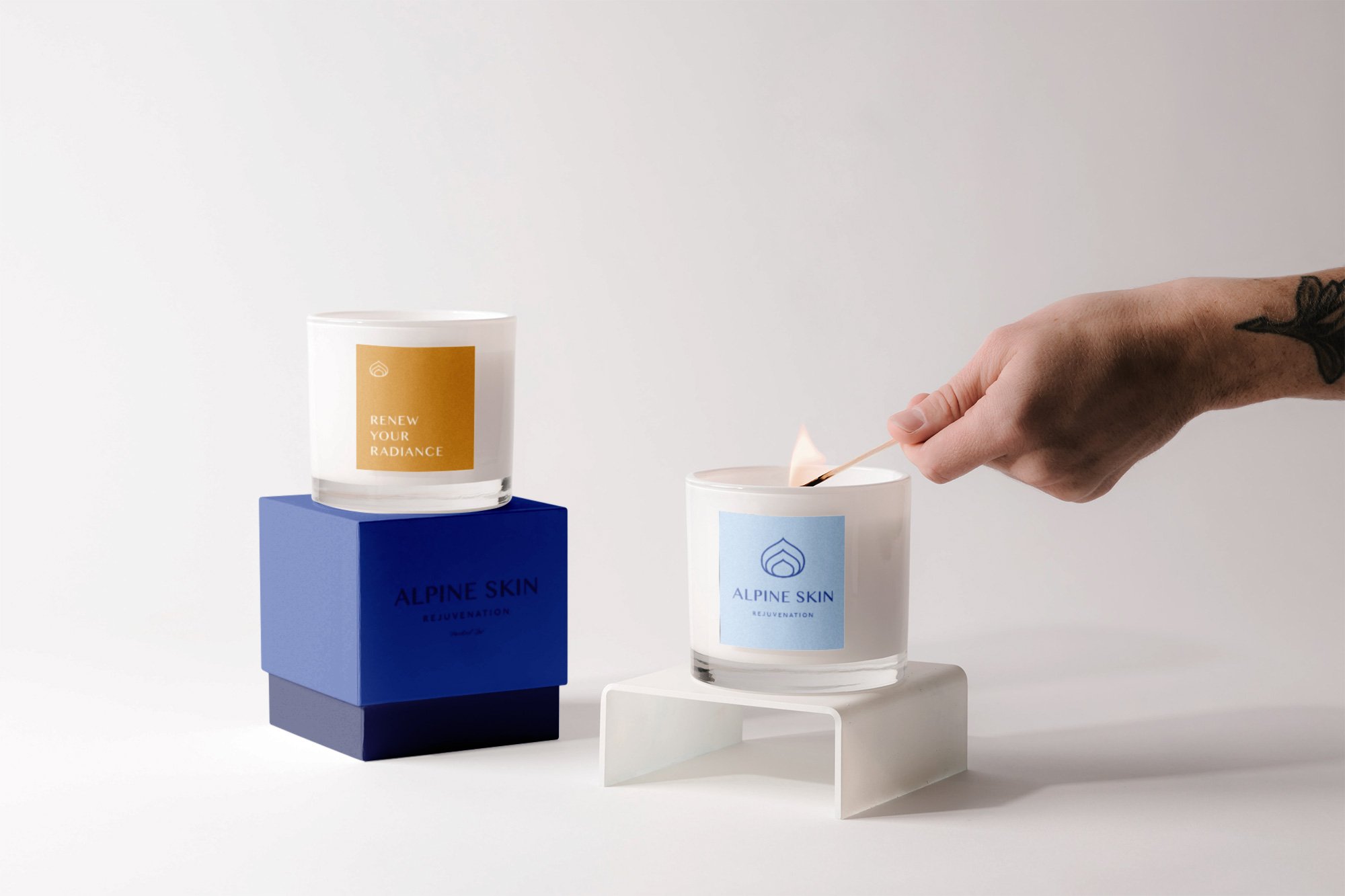
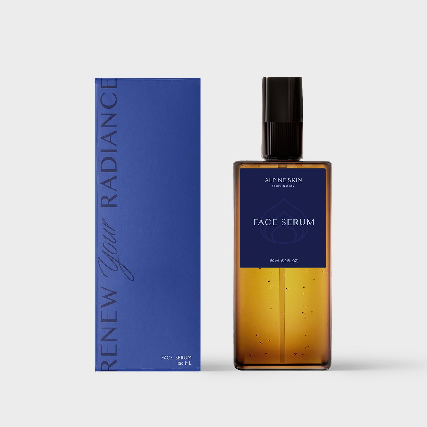
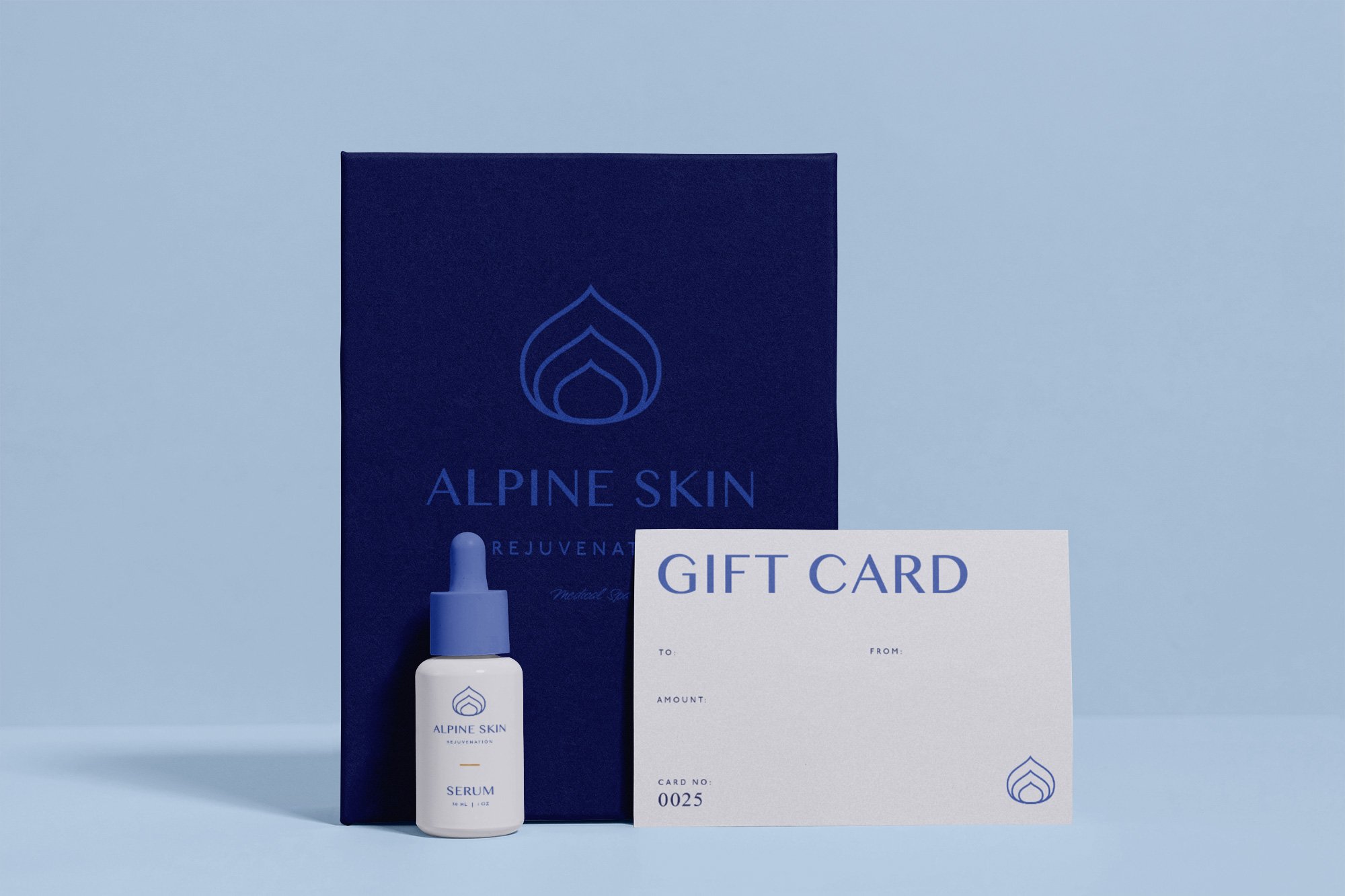
The primary logo for Alpine Skin Rejuvenation was built around a the shape of an aspen leaf, which also resembles a drop of water. The three leaf shapes are stacked so they seem to “grow” out of the wordmark, reiterating the idea of “rejuvenation” in the company name. Simultaneously, the three shapes mimic dew drops on a leaf which was a motif pulled from a photo taken by the client which hangs in her office. For the wordmark, we chose a sans serif typeface to elevate the brand and convey feelings of trust and elegance. The blue color palette chosen to further tie the brand to the mountain town community, as they mimic the colors of a snowy mountain peak. We chose to add a tiny bit of aspen gold to the color palette in order to bring some warmth to the brand and further nod to aspen leaf photo taken by the client.

